Distance between flexbox items
Ever wanted to set a gutter between your flexbox items? This is, in my opinion the best way to do it. It doesn’t require negative margins or padding hacks, which will lead you to only struggle more. By the way, this method hooks on columns and doesn’t need additional div’s or inner containers.
Let’s start out with a basic flexbox grid. To keep things simple, I’m using the gridly library. This works the same with bootstrap, foundation or any flex grid.
<div class="container">
  <div class="row">
    <div class="col-fifth">Hello flexbox</div>
    <div class="col">this takes the space left</div>
  </div>
  <div class="row">
    <div class="col-half">half</div>
    <div class="col-quarter">quarter</div>
    <div class="col-quarter">quarter</div>
  </div>
</div>
I’m always wrapping up the rows in a container, just so I can easily change the width of my test board. Let’s add some css for that:
.container {
  width: 90%;
  margin: 50px auto;
}
Nothing new so far, here’s a jsfiddle representing the grid:
Now, we will add a border to the columns, so that we can distinguish them.
Because I don’t like to use a framework class to add properties, I’ll add a new class to my columns (bordered). If you’re lazy [class^="col"] would work as well in gridly’s case.
.bordered {
  border: 1px solid red;
}
First thing you may notice is that the second column of the first row doesn’t end up at the end of the container. This is an easy fix, and will be important for a later alignement. Just add box-sizing: border-box;:
Great! It looks bad though, we want a gutter!
When I’m looking for ideas, I often just google up what I want, and usually end up on stackoverflow. This post for example is one of the first results. There are multiple ideas to implement a gutter, but I really like the idea of using transparent borders.
First, it allows us to not add any margins/paddings on rows/columns. Then, with the box-sizing set to border-box, the browser should compute the width of our columns by taking the border size into consideration. No width tweaking either!
Let’s do just that by changing or border size to 0.5em so that the resulting gutter is 1em:
.bordered {
   border: solid .5em red;
   box-sizing: border-box;
}
Okay, we now have a gutter. Still, this doesn’t look good and we don’t want a red gutter. For that, we can change the border color to transparent, but it would be prettier if we could keep borders no?
There’s a css selector that gives us just that ability, naming ::before:
::before creates a pseudo-element that is the first child of the element matched. It is often used to add cosmetic content to an element by using the content property. This element is inline by default.
We will use .bordered::before to set up a fake columns on top of the existing one. For that to work, it has to be the same height and width as our real column. The simplest solution I’ve found is to use an absolute position:
.bordered {
   border: solid .5em transparent;
   box-sizing: border-box;
   /** relative so that our ::before absolute block can position itself according to it's parent block **/
   position: relative;
}

.bordered::before {
  content: '';
  border: 1px solid red;
  /** pseudo-elements are inline by default **/
  display: block;
  /** same height and width than our column **/
  width: 100%;
  height: 100%;
  /** position absolute starting at the top and left of our column **/
  position: absolute;
  top: 0;
  left: 0;
  /** we want the pseudo-element to be behind our real column **/
  z-index: -1;
}
There we go, check out the result:
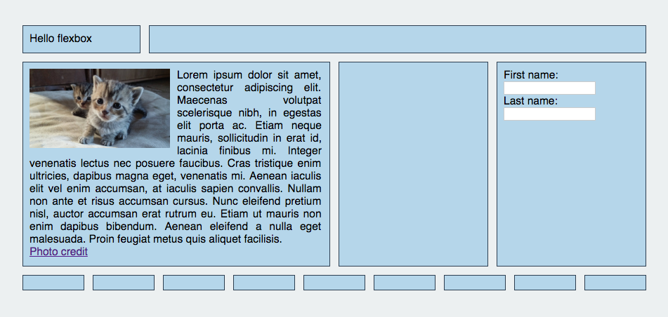
Now, we can get more fancy! Add some padding, some colors and play with the column contents to check if everything is fine. What’s nice with this method is that you can also change the justify-content property by keeping your gutter!
A more complex example: